Mastering Modern CSS: When to Use Grid vs Flexbox
CSS Grid and Flexbox are powerful layout systems that have revolutionized web design. In this comprehensive guide, we'll explore their differences, optimal use cases, and how to combine them effectively.
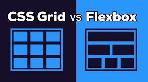
Core Concepts
CSS Grid
- Two-dimensional layout system
- Layout-first approach
- Explicit row and column control
- Perfect for complex layouts
Flexbox
- One-dimensional layout system
- Content-first approach
- Dynamic space distribution
- Ideal for component layouts
When to Use CSS Grid
Complex Page Layouts
.page-layout {
  display: grid;
  grid-template-columns: 250px 1fr;
  grid-template-rows: auto 1fr auto;
  grid-template-areas:
    "header header"
    "sidebar main"
    "footer footer";
  min-height: 100vh;
}
Responsive Image Gallery
.gallery {
  display: grid;
  grid-template-columns: repeat(auto-fit, minmax(300px, 1fr));
  gap: 1rem;
  padding: 1rem;
}
When to Use Flexbox
Navigation Menus
.nav-menu {
  display: flex;
  gap: 2rem;
  justify-content: center;
  padding: 1rem;
  background: #f8f9fa;
}
Card Components
.card {
  display: flex;
  flex-direction: column;
  max-width: 400px;
  box-shadow: 0 2px 8px rgba(0,0,0,0.1);
}

.card-content {
  flex: 1;
  padding: 1.5rem;
}
Combining Grid & Flexbox
Pro Tip: Use Grid for overall page structure and Flexbox for individual components within grid cells.


Comments
Leave a Comment